When Marble Color Turns Into a Real Design Decision
“Can we make the marble feel designed, not just ‘installed’?”
The designer said it while holding three samples under the same spotlight. One looked romantic. One looked calm and architectural. One looked “quiet luxury” in the render—but slightly cold in the real room. That’s the truth about Marble Color decisions: you’re not choosing a surface, you’re choosing a mood engine that will react to light, furniture, wall paint, and daily life for years.
This guide is written for specifiers and buyers who want confident color decisions—especially when the project involves pink/purple tones, green character stones, and modern grey palettes. It’s grounded in project logic, practical color theory, and real sourcing discipline from icestone. If you’re building a shortlist, starting from the icestone collection helps you align “style intent” with consistent supply, matching, and production-ready slabs.

Marble Color
Why Marble Color Matching Is Harder Than It Looks
Marble isn’t paint. It’s a natural material with depth, veining direction, and mineral variation. That’s why two samples can look similar in the showroom but behave very differently in the actual space.
In high-end projects, the most common color-matching failures come from:
-
Lighting mismatch: warm LEDs vs daylight vs mixed lighting change undertones dramatically
-
Scale shock: a small sample hides large veins that dominate once installed
-
Gloss vs texture: polished reflects light and exaggerates contrast; honed softens it
-
Adjacent materials: wood species, metals, fabrics, and wall colors pull marble warmer or cooler
If you want to evaluate color families efficiently, browse curated options under marble slabs first, then narrow by scenario: living space calmness, hospitality drama, retail contrast, or residential warmth.
A Practical Color Framework: Choose Marble Like You Choose Lighting
Instead of picking marble by “favorite color,” use a simple framework specifiers rely on:
-
Identify the space style: minimalist, classic, boutique, modern luxury, artistic
-
Define the atmosphere goal: calm, dramatic, warm, crisp, romantic
-
Decide the contrast level: low-contrast (quiet) vs high-contrast (statement)
-
Confirm lighting temperature: warm (2700–3000K), neutral (3500–4000K), cool (5000K+)
-
Choose a color family: green / grey / pink-purple (then select a specific stone)
If your team wants to validate a palette and prevent expensive “we love it… but not here” moments, you can contact icestone early with your style references, lighting plan, and use scenario. That’s when color matching is easiest—before drawings lock.
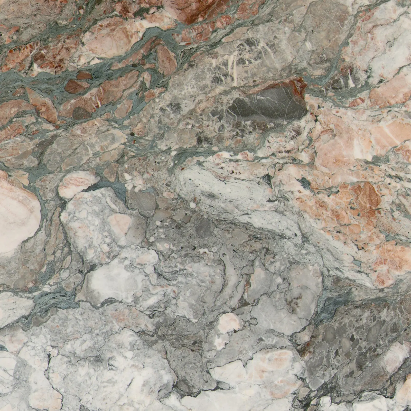
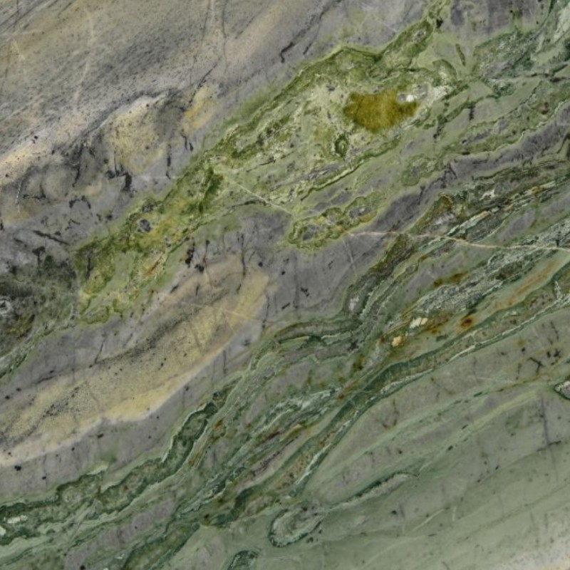
Green Marble: When You Want Nature, Depth, and Authority
Green marble is one of the fastest ways to make a space feel premium without shouting. It brings natural authority and a grounded feel—especially in lobbies, reception zones, feature walls, and “statement-but-calm” floors.
Where green marble performs best by style
-
Modern luxury: pairs beautifully with matte black metal, brushed brass, and warm oak
-
Classic European: works with cream walls, arches, and warm lighting
-
Boutique hospitality: ideal for feature counters, lounge walls, and elevator cores
How to keep green marble looking intentional
-
Use low-contrast companions (warm whites, soft greys) to avoid visual chaos
-
Align veining direction in primary sightlines
-
Keep joints and cut lines away from “hero moments” like reception desks and thresholds
A strong, character-driven option for this family is Antique Green Marble, which fits projects that want depth and history—especially when you balance it with calmer materials and controlled lighting.

Wide-Ranging Applications of Icestone’s Four Season Green Marble
Grey Marble: The “Quiet Luxury” Workhorse for Modern Spaces
Grey marble is the most versatile choice for contemporary interiors because it behaves like a design neutral—yet still reads expensive when selected well.
Best matches for grey marble spaces
-
Minimalist interiors: pair with off-white walls, microcement textures, and black detailing
-
High-end retail: pair with glass, directional lighting, and crisp signage
-
Office / public zones: pair with acoustic fabrics, warm woods, and soft metal tones
Grey marble mistakes to avoid
-
Choosing a stone that turns “blue-cold” under cool LED lighting
-
Using high-polish in high-traffic floors without a maintenance strategy
-
Overloading the space with too many grey tones (grey marble + grey wall + grey floor = lifeless)
If your “grey” concept needs brightness and a more luminous, airy tone—especially in circulation zones—white-based marbles with subtle cool energy can outperform pure greys in perceived comfort.
Pink / Violet Marble: Boutique Warmth Without Looking “Too Sweet”
Pink and violet marbles are making a serious comeback in high-end interiors—especially in boutique hotels, luxury dining, and creative residential spaces. The trick is to use them like a controlled accent, not a full-room sugar rush.
A refined option for tables and statement surfaces is Fantasy Violet Marble. It suits modern spaces that want personality without chaos, especially when paired with:
-
Warm whites and creams
-
Walnut or smoked oak
-
Soft brass or champagne metal
-
Matte black frames for contrast
Where pink/violet marble works best
-
Feature tables, bar tops, and lounge counters
-
Powder rooms and vanity areas
-
Boutique retail “hero” zones
A buyer tip that prevents regret
When using bold color marbles, test them under the final lighting temperature. Pink/violet tones can swing from elegant to overly saturated depending on LEDs and nearby wall paint.

Fantasy Violet Marble for Project
Bright White with a Cool Twist: When You Want Clean, Modern, and Light-Driven
Sometimes the best “grey” or “green” matching move is actually to introduce a bright, light-reactive white stone that stabilizes the palette. This is especially true for atriums, airy modern homes, and spaces where daylight is a major design element.
Ice Connect Marble is a strong choice for projects that want that clean, luminous base—helping green and grey accents look more intentional, and keeping pink/violet features from overwhelming the space.
Common use cases include:
-
Large wall panels behind reception desks
-
Stair zones and vertical circulation for brightness
-
Gallery-style interiors where color accuracy matters
Black Marble with Gold Energy: High Drama for Luxury Statements
Black marble is the fastest way to create contrast, but it needs discipline. In luxury interiors, black works best when it has “structure”—clear veining, metallic energy, or a controlled pattern that reads intentional.
For that dramatic, high-end effect, Golden Portoro Black Marble is suited for:
-
Feature walls and fireplace surrounds
-
Luxury retail counters
-
Bar fronts and VIP rooms
-
Framing accents in otherwise calm palettes
How to avoid making black marble feel heavy
-
Balance with high reflectance materials (white stone, light plaster, warm oak)
-
Use controlled lighting (wall washing instead of harsh overhead glare)
-
Keep black marble to “anchor zones” rather than every surface
Quick Color Matching Cheat Sheet (Pink vs Green vs Grey)
Use this as a fast decision guide:
-
Choose green marble when you want: natural authority, calm drama, heritage character
-
Choose grey marble when you want: modern neutrality, long-term flexibility, quiet luxury
-
Choose pink/violet marble when you want: boutique personality, warm elegance, controlled statement
-
Add white luminous marble when you want: brightness, palette stability, modern cleanliness
-
Add black-with-gold marble when you want: high contrast, luxury framing, statement impact

Calacatta Grey Marble for Bathroom
FAQ
1) What marble color works best for modern interior design?
Grey and bright white marble tend to work best for modern design because they support minimal palettes, clean lines, and flexible furniture changes over time.
2) Is green marble suitable for flooring?
Yes—especially in feature zones or luxury interiors—when the finish and maintenance plan match the traffic level. Green marble is often chosen for its calm authority and natural depth.
3) How do I stop pink marble from looking too bold?
Use pink/violet marble as an accent surface, balance it with warm whites and wood tones, and test it under the final lighting temperature before sign-off.
4) Does marble look different under warm vs cool lighting?
Yes. Lighting temperature can shift undertones significantly—grey can turn blue-cold, green can look darker, and pink can become overly saturated. Always test with real lighting.
5) What’s the best way to ensure consistent color matching across slabs?
Work with a supplier who can manage block selection, batch control, and layout planning. Request slab photos and mock layout previews for large or highly visible areas.
Marble Color Is a System Decision, Not a Sample Decision
“Can we make it look designed, not installed?” Yes—when Marble Color choices follow a real system: style intent, lighting reality, contrast planning, and sourcing control.
Green brings nature and authority. Grey delivers quiet luxury and flexibility. Pink/violet adds boutique warmth when used with restraint. Bright whites stabilize palettes. Black-with-gold creates high drama when used as a controlled anchor.
If you’re building a palette that has to stay beautiful beyond opening day, use real-light testing, plan veining direction, and align your selection with consistent supply. Starting from icestone’s collection and shortlisting by scenario makes decisions faster, cleaner, and far more reliable than picking from a tiny swatch and hoping it behaves.
Choose marble color like you choose lighting: start with the space style, the atmosphere you want, and the final lighting temperature, then select marble that supports that intent at full slab scale—not just a small sample. Keep green marble calm by pairing it with warm whites and controlled contrast; keep grey marble premium by avoiding overly cool LEDs and excessive grey-on-grey layering; keep pink/violet refined by using it as an accent and balancing with wood and soft neutrals. Always request slab photos and batch consistency checks for highly visible zones, and align veining direction with primary sightlines. That’s how marble stays cohesive and luxurious long after installation day.